Showing posts with label politics. Show all posts

Saturday, December 10, 2016

Supreme Court Politics

I had wanted to post this before the US Election, but time constraints didn't allow.  With the potential for new Supreme Court Justices in the next four years, many voters and namely single-issue voters rallied behind Donald Trump for his seeming support for a conservative justice.  Most of the people I spoke with were primarily concerned with the potential appointment of a justice who could help in concentrating efforts in overturning abortion.  For a more in-depth look on Trump, his stances and commentary on overturning abortion I found this article to be helpful.

I was curious in the past how the political leanings of the Justices has changed over time and if opportunities like a conservative bench with a republican president have occurred in the past.  I was curious because I wondered if an appointment during the Trump administration would change anything.

The graph below shows the amount of abortions over time during different presidents and each point shows the political split of the bench (Democrat-Republican).


Political leanings on a bench aren't indicative of a pro-life vote.  However, learning more conservative politically does provide potential for a favorable pro-life vote.  I found this information interesting since the split on the court has predominantly been conservative for the last 40 years and only recently has it become more liberal.  The graph speaks for itself and the code for it is available here.

This information isn't put out here to necessarily change minds on this issue.  That's best done around tables where both sides can listen, but I thought this was helpful for understanding some of the numbers and history on this particular circumstance.  

Wednesday, January 20, 2016

State of the Union Speeches and Data

I've done a couple posts on the SOTU speeches.  In the past these dealt with word count, approval, and the vague notion that the applause the president receives has a relationship with his approval rating at that time (which had a lower correlation this year in fact).

Wired had a good article highlighting the sentiment in the current and previous State of the Union (SOTU) speeches.  They went through the speech for several of the past years, highlighted the events that occurred each year, and gave the corresponding frequency or usage of terms in the speech that communicated the impact of those events.  This blog post is not duplicating the article.  I did see the graph though and wanted to see if I got a similar sentiment score for the speeches.  I used the 'syuzhet' library in R to conduct the analysis (big thanks to Matthew Jockers for the package).


The graph is similar to the one in the Wired article, but not entirely.  Some smoothing was involved and perhaps a different sentiment analysis technique.  We do see a similar finding in the most recent SOTU speech:  it ended with the highest sentiment score out of all the speeches.  Several of the speeches in my analysis showed a curving up toward the end, which would in general go along with "ending on a positive note".  Additionally, one can see the "valleys" or lower sentiment values occurring between the 50 and 75 time intervals.  This isn't too surprising in that the same speech writer is being used and that the SOTU has perhaps a more standard sentiment form (another analysis perhaps?).  

This same library has a function which scores certain words to emotional categories.  These 10 categories include a positive/negative categorization.  Along with these, I added in the applause count for each speech and the approval rating for each year for the time period of the speech.  The matrix below depicts the correlation values of each category with corresponding color.  Additionally, I added in a p-value scoring for each relationship, those >.1 were given bubbles.


There's a lot here in terms of what could be said about the speeches but I'll only say a few things that I thought were interesting.  The applause/approval rating correlation showed a weaker value than last year (-.5), which isn't too surprising since this is probably spurious anyways.  Negative word categorization and applause had a higher correlation than positive word categorization and applause.  Meaning, when comparing applause and negative word use across speeches, these counts varied in a similar way (applause count higher - negative word count higher and vice versa).  Speeches with words categorized as "anger" or "fear" had a weak correlation to the applause count.  Conversely, speeches with words categorized in emotions like "joy", "surprise", and "trust" portray a stronger correlation with applause count in those same speeches.  So perhaps to get more applause in general, certain positive words are better than others?  Yoda's advice about fear would make sense here in that words associated with fear tend to vary similarly to words associated with anger.

We also see a decent amount of correlation among more positive emotions as well as within more negative emotions.  This refers back to the common "curve" that these speeches may have.  In that the sentiment used year over year tend to be similar, or at least the emotional categorization of words follow similar patterns.

Thanks to Matthew Jockers, Taiyun Wei, and Hadley Wickam for their work on the 'syuzhet', 'corrplot', and 'ggplot' packages respectively.  Code for the above analysis is on my github page.

Monday, January 26, 2015

Presidential Approval and Applause

Some may have seen a twitter post about spurious correlations that myself and others mentioned on twitter.  Basically this was a joke about how correlation can be found in many things that certainly have no influence over each other.  I mention this because this post may or may not be in that category ;-)

About this time last year I looked at the two most recent State of the Union speeches and talked about the political priorities ostensibly shown in each.  For those that don't know, The State of the Union is the speech that the President of the United States delivers at the beginning of each year to a joint session of Congress (that is, both House and Senate).  For the most part or at least traditionally the aim of this speech is to outline the priorities for the next year for the President's office and to give a bit of an idea where the United States is at in general, or the "state of the union".

One of the more nuanced parts of the speech is that there are periods where the President is either interrupted with applause by members who feel what he is saying is good, or where he pauses to allow for applause (typically from his party).  The speeches are fairly lengthy.  The past several years these speeches have averaged about an hour.  Turns out applause is definitely a big part of the speech (it's polite afterall).  For President Obama's terms in his speeches, the word "applause" appears more than any other word (outside articles).  If applause lasts about 10 seconds on average, we're looking somewhere around 12-13 minutes of total applause during his speeches.  This doesn't take account the length of the applause times as in the text of the speeches it is only shown as "(applause)".

So what's the point other than that's a lot of clapping?  I wanted to look at if there was any similarities between the applause being given and the President's approval rating.  Appropriately, I'll be using a popular graph theme from the political analysis etc. site fivethirtyeight to display this brief analysis.  The theme was actually put together in R here, by Austin Clemens (thanks!).


So just by looking at the two lines, one indicating the number of times applause occurs during the speech, the other indicating the % approval (though the scale on the left not in % terms), we can see that it doesn't change a lot.  Except for two years, 2010 and 2014.  In 2010 he received 50% more applause than in the other years and about 30% more in 2014.

The question becomes, is the applause tactical to show support for the president by the party in a period of lessening approval?  The correlation coefficient was -.50, but as with spurious correlations, this very well could speak nothing of the influence of approval on the amount of applause.  In general just looking at the graph, the percentage change isn't the same for Applause and Approval however we can see that in general the change year over year between Applause and Approval certainly has an inverse relationship.   Meaning the line moves up for Applause between 2009 and 2010 then the line moves down for Approval rating for the same period.

Showing support and unity for a party leader by applauding is certainly reasonable, especially when support may be lacking from the general public.  Guessing as to whether this is considered before in response to the approval rating is more difficult.  Then again, it's a bit more fun to think that members of Congress would tactically use this:


  Code for this will appear on my Github page.

Thursday, January 30, 2014

State of the Union Speech Comparison

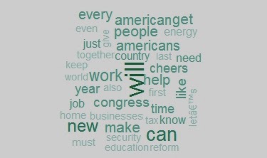
The State of the Union is historically a speech used to set the tone for the year...at least I think that's what it is.  The process of writing these speeches has been discussed before and first-hand detail is available in this article.  I was interested in seeing the difference in language between the 2013 and 2014 State of the Union address in terms of what was said.  A lot was said in each speech so I narrowed it down to words that were mentioned 20 times total in the two speeches.  Below is a wordcloud showing these words, with the larger words having a higher frequency.


You can see just from this wordcloud how these speeches seem to take a more emphatic/determined/action-oriented tone with the word "will" having the highest frequency (aside from another word we will see below).  Also, you can get an idea of some of the policy issues he discussed.

As noted before, I wanted to compare the two speeches to see which words were being used more/less when comparing the two.  The number of times a word is mentioned in the 2013 State of the Union address is on the X-axis and the 2014 address is on the Y-axis.


Probably one of the odder yet clearer takeaways from this graph is the applause given in 2014 vs 2013 (in the speech text this appears when there is pause for applause also for cheers).  The President went into this speech having a very low approval rating.  That being said, was the applause a function his party knowing his lack-luster rating?  Or was it just that the speech was better and elicited much more applause than last year?  It is interesting that this year's speech received more than 10 additional pauses for applause than 2013.  "Jobs" was used more last year in the speech than this year whereas "help" was used more this year.  This may reflect some of the policy decisions with the Affordable Healthcare Act having been past and other programs intended to provide "help" for Americans.   Last year after the election jobs and employment were a large part of what worried many Americans (and for many still does).  "Energy" was mentioned much less in this year's SOTU.  Perhaps the controversy over the Keystone XL pipeline influenced the topic of energy as a priority in the speech this year.  Many of the words were also very linear in their use (seen clustered around 10).

Context is certainly important in speeches and this technique of comparing words by no means completely depicts what is important or how things were communicated.  However, the words that are chosen for these speeches are strategic and outline (if not in function than in form) the year for the president and his priorities.