Thursday, February 20, 2014

Most Entertaining NBA Teams


In a previous post I highlighted the Thunder keeping more of their games closer (within 3 points) than anyone else in the NBA.  As the season has progressed, this has changed.  The Thunder are still in the top five of most close games as of 2/19/2014, but the Mavericks, Warriors, and Hawks have more.  If a game is close, by itself that doesn't say necessarily much about either team that was in the match-up or that their match-up is particularly good.  This isn't necessarily indicative of the ability of teams (more close games=better team or vice versa), but I think it does indicate entertainment value of the games or stress incurred by fans.  Below is a bar graph showing each team and how many games they have had that ended with each team being within 3 or less points.


The network below shows who the match-ups were with.  Again, the Pacers having only 3 games within 3 points isn't indicative of their current No. 2 rank at 41-13.


Here I'll propose a metric that attempts to capture the entertainment value of the games a team plays, with a few assumptions:  we are more entertained the more teams win and close games are fun to watch.  Below shows a graph with close games against total wins of a team.  The points are sized according to a "team entertainment" metric or (No. Close Games/Season Losses).  This communicates a team's ability to win as well as to provide entertaining games along the way (close games being entertaining).


The Thunder rank the highest on this metric with the Trail Blazers, Heat, Warriors, and Mavericks also ranking high.  Arguably, this makes the Thunder the most entertaining team to watch...at least this far in the season.

Thursday, January 30, 2014

State of the Union Speech Comparison

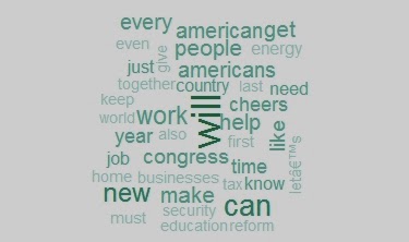
The State of the Union is historically a speech used to set the tone for the year...at least I think that's what it is.  The process of writing these speeches has been discussed before and first-hand detail is available in this article.  I was interested in seeing the difference in language between the 2013 and 2014 State of the Union address in terms of what was said.  A lot was said in each speech so I narrowed it down to words that were mentioned 20 times total in the two speeches.  Below is a wordcloud showing these words, with the larger words having a higher frequency.


You can see just from this wordcloud how these speeches seem to take a more emphatic/determined/action-oriented tone with the word "will" having the highest frequency (aside from another word we will see below).  Also, you can get an idea of some of the policy issues he discussed.

As noted before, I wanted to compare the two speeches to see which words were being used more/less when comparing the two.  The number of times a word is mentioned in the 2013 State of the Union address is on the X-axis and the 2014 address is on the Y-axis.


Probably one of the odder yet clearer takeaways from this graph is the applause given in 2014 vs 2013 (in the speech text this appears when there is pause for applause also for cheers).  The President went into this speech having a very low approval rating.  That being said, was the applause a function his party knowing his lack-luster rating?  Or was it just that the speech was better and elicited much more applause than last year?  It is interesting that this year's speech received more than 10 additional pauses for applause than 2013.  "Jobs" was used more last year in the speech than this year whereas "help" was used more this year.  This may reflect some of the policy decisions with the Affordable Healthcare Act having been past and other programs intended to provide "help" for Americans.   Last year after the election jobs and employment were a large part of what worried many Americans (and for many still does).  "Energy" was mentioned much less in this year's SOTU.  Perhaps the controversy over the Keystone XL pipeline influenced the topic of energy as a priority in the speech this year.  Many of the words were also very linear in their use (seen clustered around 10).

Context is certainly important in speeches and this technique of comparing words by no means completely depicts what is important or how things were communicated.  However, the words that are chosen for these speeches are strategic and outline (if not in function than in form) the year for the president and his priorities.  

Saturday, December 28, 2013

Lyric Analytics

I was messing around with the text mining (tm) package in R and was thinking of something I could comb through.  I looked through some other blogs and websites to see how they were using it:  mining through presidential speeches debates being one of the more notable uses.  I was thinking about it in terms of where we focus mostly on how things are said and really not what is actually said...ie music.  For some people, what is said is important and I would argue for most artists who, "make it" eventually it comes around to be important to an artist's being catapulted into fame :-)


One of the greater(est) rock and roll icons who began making albums slightly before my ears were ready for it is "The Boss".  Lots of albums, lots of words.  Although Bruce Springsteen was definitely communicating a lot of powerful ideas in his music, ultimately it's the passion he sings with, the way he is miraculously able to have a sax weaved into most of his songs, or just having come up with the nickname "The Boss" that makes him awesome.  Anyways, I thought about looking at the album Born to Run as a primer in what I'll call, "lyric mining".

Below is a graph showing the most frequent words used in the album across every song that are mentioned at least 5 times.  For those of us familiar with the album, if you just look at these words you can hear the music.

Number of times words are used in the album Born to Run

Below is a heat map showing words and their corresponding albums (lighter the colors = more usage).  I chose only words that were mentioned at least 5 times in the album, otherwise it was too large.  On the axis not labeled are dendograms (basically a graphical way to show how things are associated or how similar they are - more on how to read them here).  Each cell in the heat map has a bar graph showing the relative usage of the word...highest being 10 times in one song...that being the word "one" in the song "She's the One".

Born to Run album Heatmap

In terms of what is said you'll notice that the song "Night" is associated with "Jungleland"(height of the lines and being in the same "clade" on the dendogram) in terms of the words used, at least those that are used at least 5 times.  Here's how this looks when they are graphed against each other:

Night lyrics graphed against Jungleland lyrics for words mentioned 5=< times
Alternatively "10 Avenue Freeze Out" is an outlier in terms of word usage among the other songs as you can see it sits relatively unconnected from other songs in the dendogram on the x-axis.

On the y-axis you can see the associations across different words and their usage.  "Night" and "One" even though they are used a lot are not distributed the same (different "clades")...meaning when "The Boss" is belting it out, he's using these words in different places - different songs.

Which brings up an interesting point about great albums (in my opinion):  their distribution of themes.  "Born to Run" definitely has some great themes in it and while I won't interpret the meaning of each song, we can see it through the distribution of words in the lyrics and songs in the album.  While we know the song themes are strong in this album, we can also see (through the word distribution) that the great themes are distributed across the album and it's not just one song that makes this album great.